
Symbolizing Minnesota
Comparing the classic and new state emblems

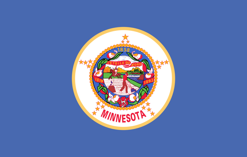
Minnesota finally knows what her new state emblems are going to be. On Tuesday, December 19th, the State Emblems Redesign Commission (SERC) made their final adjustments to the flag that will represent the North Star State as of May, 2024.
High emotion swirls around the redesign. Many people are upset about the redesign, for aesthetic reasons, historical reasons, or both. Others are celebrating the new designs – or at least the retiring of the originals – enthusiastically.
Symbols matter. People care about the flags and emblems that are supposed to represent them or something they love. In a state that is home to more than 5 million people, there’s a lot of caring to go around when someone decides to up and change the images that have represented us on the national stage since before statehood.
I’m going to talk about what these new symbols mean, but first, I’d like to get us all on the same page about the flag and seal that are being retired. Because let’s face it, a lot of people on both sides had to search “what is the Minnesota state flag?” when they first heard about the redesign.
Our original flag and state seal are essentially the same design. The flag is a blue banner with the state seal in the center, wreathed in lady slippers. The seal itself stars a humble farmer tilling his field amid a scene of our land’s abundant natural resources – the Mississippi River and St. Anthony Falls, the pine trees, and the rich fields stretching toward the horizon – which made the settling of Minnesota possible. Behind the farmer is an Indian on horseback, spear in hand, riding off into the distance. Framing the design is the state motto “L’etoile du Nord” overhead and the year of statehood, 1858, bellow.
The criticism of the classic emblems is essentially this: that they symbolize an oppressive routing of the American Indians from their land by the settlers, who took it for their own. To that way of thinking, the state seal is a scene of wicked imperialism, white supremacy, and injustice.
I have neither the expertise nor the time in this article to lay out the history of relations and conflict between the Indians and the white settlers, but I will at least grant the critics this: it’s complicated. The settling of the original 13 American colonies and the later western expansion of the American nation were a vast and drawn-out example of the clash of civilizations that has happened many times across many locations in human history. To my knowledge, there has never been such a clash that has ended without conflict, and in such conflicts, one side conquers, and the other is conquered. To boil that all down to “red man good, white man bad,” or vice versa is utterly ridiculous, but that’s what the people who criticize our state’s original emblems, and the very existence of our state and nation at large, do on a regular basis.
I for one feel quite differently. I don’t think the seal is a put down of the American Indian or reveling in the deaths of any of their people. Is the image that of a white soldier waving the Indian’s scalp? Is it a white man burning a teepee? No. The Indian on this seal is painted in a very proud light, astride his horse with his weapon in hand, strong and impressive. The farmer in the scene keeps his rifle near at hand, wary of this neighbor, but he doesn’t pick it up to fire at the Indian unprovoked. This simple scene captures the spirit of Minnesota’s history and heritage. We are a state that exists because a few ordinary men dared to settle a wild, remote, and dangerous place. Those men did so on a land that was already occupied by another people, and there was conflict over that land. That’s not unique to America by any stretch of the imagination. What may be unique to America, however, is the amount of respect and admiration shown in our public symbols toward the original inhabitants of the land our ancestors conquered. All you have to do is read Folwell’s A History of Minnesota, vol. I, appendix 7, to see just how concerned the creators of the original seal were with showing respect to the American Indians, and the ambition they had for peace between them and the white settlers.
With all that said, there is one other criticism to consider, specifically about the flag: it doesn’t do the job of a flag very well. Not because the symbolism is poor – we’ve already established that it’s good – but because our state seal is just too detailed to be recognizable at a distance, especially on a piece of cloth that’s either hanging limp on a flagpole or billowing in the wind. Honestly, did you ever see the Minnesota flag flying and recognize any of the imagery unless you already knew what was on it? Of course not! You have to see it up close, hanging perfectly still on a wall, or else look it up, to know what’s on it. When you or I first did either of those things, we discovered the beautiful image that I’ve already spent so many words praising. But you shouldn’t have to look up a flag on the internet to know what’s on it. The stars and stripes, the union jack, and other great flags exemplify this quality. They are simple yet meaningful designs that can be easily recognized and reproduced, even by a toddler with half a box of crayons.
I point out all of this to say that, if the problem of function was the problem being addressed by the SERC, I and many others would have been all on board. I want a state flag that’s functional as well as meaningful and beautiful. But that was not the reason, not even the pretend reason, that our current leaders in Minnesota decided the flag had to go. If it had been, they would have updated the flag and left the seal alone.
In any case, the DFL made their decision, and now we’ve got the new emblems, so we might as well see what they’re all about. Since the seal is where the problems really stack up, we’ll get the flag out of the way first:
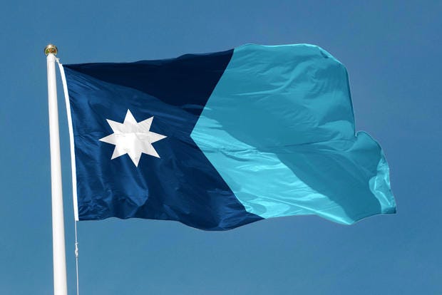
This is an unpopular opinion right now among those who are upset about the redesign, but on its face, I kind of like the new flag, even though there were submissions I liked better, and I wish they had kept the green stripe on the initial version of the submission they selected. Green and blue have been Minnesota’s colors for as long as I can remember, and the additional color would have made the flag a little more interesting. That said, this new flag, with the shape of Minnesota herself and the waters of our state represented in two shades of blue, and the north star proudly displayed, would be a decent flag. It fixes the functionality problems that I mentioned earlier, being distinct and simple enough to recognize at a distance, limp or waving, even when hanging among other flags. I don’t have any damning problems with the new flag in and of itself. But how about the seal?
Well, now we start to have problems. Big problems. Here’s the new design for the seal as originally submitted:
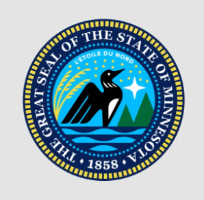
Once again, on its face, it’s actually rather pretty. It contains so many of our state symbols, including the loon, the pine trees, and the wild rice. The nineteen stars which represent our state’s place in the union after the original 13 are a very traditional touch for an American state seal or flag. Add to that the fact that the whole scene is framed by the state motto and year – just like the original seal – and you’ve got a solid design for a Great Seal of the State of Minnesota. However, the critical advantage that the new flag has, the new seal lacks: it’s not fixing something that’s broken, but replacing something that’s already good!
Our original seal has nothing wrong with it. Nothing at all. There is no good reason to be updating it as if it were a profile picture on a social media page. So, even if the new design is very good, it’s pushing out a seal that is already great and which has signified our state for over 150 years. They’re only pushing it out because of the overwhelming shame and hatred they have for our state.
Now, I can feel some people beginning to scoff, if they weren’t already. You might be thinking, “Shame and hatred? Really? Maybe they didn’t need to change the seal. Maybe the new designs are dumb. Mybe the whole process was a silly waste of time and money, but come on. How was this an act of hatred?”
Here’s how. Take a look at this comparison of the finalized design (lower right) compared to the artist’s original submission (lower left) with the original above for good measure. See if you can spot the similarities and differences.
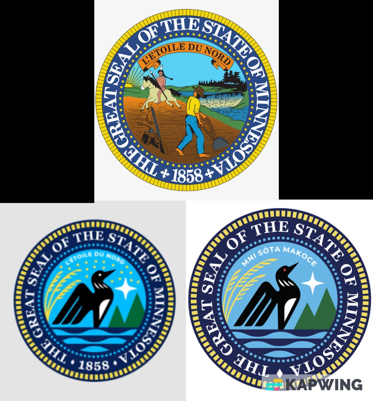
Do you see what they changed? They erased the 19 stars, signifying Minnesota’s place in the order of states added to the union. They replaced the state motto, L’Etoile du Nord, with a Dakota phrase. And perhaps most damningly, they erased the year of statehood, 1858. The only symbols remaining in our new state emblems are things that were here before Minnesota was settled by people other than the Indians; the loon, the waters, the north star, etc. The SERC has created emblems for a pre-colonial, pre-statehood, pre-American Minnesota.
This act of exchanging the old set of emblems for the new is itself one giant meta-symbol of the utter hatred and shame that the DFL and progressive liberals everywhere feel toward our nation and our states, and toward the people who transformed a wild, savage land into the greatest civilization ever known to man. It may not be a hot, blistering, foaming-at-the-mouth kind of hatred. For many, it’s merely a cold, disinterested contempt, but if anything, that’s worse. “What’s so great about the original flag?” they might say. “What is there in the original seal worth symbolizing for decades and centuries to come? After all, bad things happened to Indigenous Peoples. We can’t celebrate a nation or state that encroached on those poor, innocent people.”
That spirit of contempt toward one’s own home and history is exactly what motivates the kind of changes that we’ve seen in our state and our country – altering or attempting to alter the names of towns, buildings, landmarks, and schools. Tearing down statues of Colombus, the founding fathers, and other great men. Changing Minnesota’s state emblems are just the latest manifestation, and a very potent one.
Well, the decision has already been made. We’re getting the new emblems and that’s that. So, what can we do about it?
Here’s what I’m suggesting we do: refuse to give up the original emblems. Embrace them! Fly the classic flag at your home, your business, your school, anywhere you can think of. Don’t have one? Well, a lot of city halls, schools, and other government buildings are going to be swapping theirs out soon. Call the one closest to you and ask if you can take their old flags and seals when they make the switch. If they let you, take several and pass them out to family, friends, and neighbors. Let’s have whole streets and neighborhoods flying the classic flag, proud and defiant. Let’s have small businesses all across the state prominently displaying the classic seal on their walls. And when we go to rallies and marches and other political events, let’s show up waving dozens of classic flags. If the DFL wants to erase it, let’s make it the most popular and proudly waved state flag in the union!
And when the republicans regain a majority in the legislature, let’s make sure they know that we want our real symbols back.
I look forward to seeing many more classic flags flying in the coming months, my fellow Minnesotans.
I love how you love the new flag. Think it’s great actually. But through a bunch of bass ackwards political double speak you think we should keep flying a crazy mess of an ugly flag. You’re obviously a bright man. Come and embrace this new flag with me. With us.